Watch Webinar
Discover the latest findings from the Global IT Experience Benchmark H2/2021

|
|
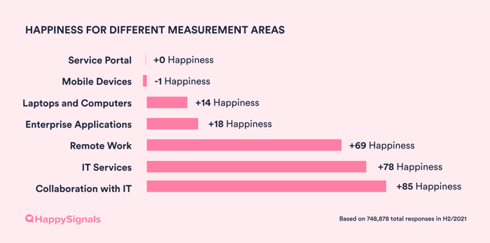
| Measurement Areas | H1/2021 Happiness | H2/2021 Happiness |
| Service Portal | -18 | 0 |
| Mobile Devices | +6 | -1 |
| Laptops and Computers | +12 | +14 |
| Enterprise Applications | +14 | +18 |
| Remote Work | +57 | +69 |
| IT Services | +77 | +78 |
| Collaboration with IT |
+79
|
+85 |
NB! When reading the overall Happiness for different IT measurement areas, remember that the scale is from -100 to +100, calculated with the same mathematical model as NPS. (Although HappySignals is not the same as NPS, as we are not asking the “Do you recommend” format question.
What this means for you?The increase in happiness with Service Portals amongst HappySignals customers’ end-users proves the impact of that experience management has had for their IT. From being the least liked IT touchpoint, Service Portal has now jumped ahead of Mobile Devices, Laptops and Computes, and Enterprise Applications in end-user happiness! Continuous measurement of experiences and making data-driven improvements has reaped concrete happiness and productivity gains for these organizations.
|
If you’re reading this report, one of your or your team’s priorities is probably to deliver better Ticket-based IT services for end-users. But how do you do that, and where should you start? This chapter aims to shed light on what our data tells about these questions.
First, let’s recap how we measure end-user experience with Ticket-based IT (Incidents and Requests). HappySignals enables our customers to send surveys to end-users in connection with each ticket resolution, asking end-users to accept the resolution by giving feedback about their experience. The surveys ask questions around these metrics:
Happiness: End-users rate how happy they are with their recent service experience on a scale from 0-10. HappySignals then calculates: % of 9-10 scores - % of 0-6 scores = Overall Happiness (a number between -100 to 100).
Productivity: End-users estimate how much work time they lost due to the service experience.
Factors: End-users select from a list of suggested reasons – which we call Factors – that influenced their Happiness rating: e.g. “Service was slow”, “My ticket was not solved”. Multiple factors can be selected.
To illustrate, one ticket-based experience might receive a Happiness rating of 5, Productivity loss of 2h 35min, due to the Factors “My ticket was not solved” and “Service was slow”.
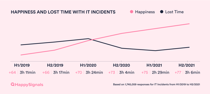
This chapter analyzes data from 615,934 ticket-based IT experiences by end-users, who are served by organizations that use the HappySignals Platform.

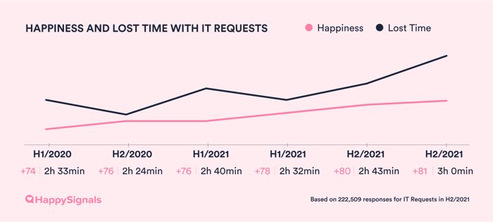
Continuing with the trend observed in our previous reports, end-user happiness with Ticket-based IT has continued to increase. In H2/2021, it reached a record high of +77.
|
|
It is worth remembering however, that our benchmark data does not represent experiences of end-users in general, but only those in organizations using HappySignals IT Experience Management Platform. In other words, organizations that have chosen to make experience management a priority.
The results hence reflect the progress organizations can make in IT Service Management (ITSM) when they have a purpose-built Experience Management Platform to enable continuous measurement and data-driven decision-making
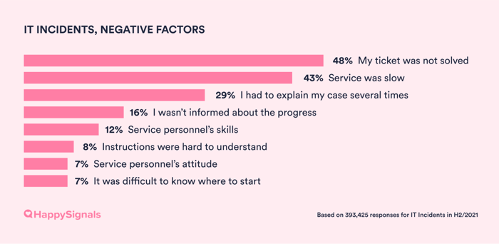
To improve ticket-based services, we have to understand the most common factors behind why end-users are unhappy with them. This ability to identify the reasons behind end-users’ reported happiness and lost time is one of the most valuable aspects of HappySignals IT Experience Management Platform.
In the survey sent to end-users in connection with a ticket resolution, we ask them to select from a standardized list of Factors, which were created based on our research with IT end-users. The Factors reflect the most common reasons for satisfaction or dissatisfaction with Ticket-based IT.
The timing of survey delivery also makes our Factors data more reliable, as it assesses end-users’ feelings about the service at the moment of their experience, rather than for example, months later in a yearly IT survey.
Different factors are presented to end-users to choose from, depending on the happiness rating they give on the 10-point scale. For example, scores from 0-6 are classified as a negative experience, so end-users are asked to select from a list of factors tailored for negative experiences. The same goes for scores from 7-8 (neutral experience), and 9-10 (positive experience). Certain personnel-related factors are included in all three scenarios.
End-users can select as many factors as they wish from the list. This is also why the percentages shown in the factors data below add up to over 100%.
NB! The way Factors are presented in this H2/2021 report has been changed since the last report. This change was made to align with the way factor data is presented on HappySignals IT Experience Management Platform. Previous reports show percentages out of total number of factors given (summing up to 100%), while the current report and the platform show percentages out of the total number of responses in that mood that have one or more factors given (summing up to more than 100%, because end-user can select multiple factors).
With IT incidents for example, 74% of responders who gave a positive happiness rating and selected at least one factor were happy about the speed of service.
The factors selected most often by end-users who rated their experiences with IT incidents negatively in H2/2021 remained consistent with previous years: “My ticket was not solved” (48%), “Service was slow” (43%), and “I had to explain my case several times” (29%).
|
|
What this means for you?To deliver better services, identify and solve the underlying causes most commonly attributed to poor experiences. Remember, that our data captures factor selection across all HappySignals-using organizations. The top negative factors in your own organization could be different.
|
Discover detailed historical data in the PDF Report.
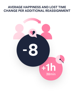
Each additional time a ticket is bounced, happiness falls by close to 8 points, while end-users lose 1h 38min more of their work time.
These add up to 8h 24min lost when tickets were reassigned four times!
Our data over the last 3 years about the frequency of ticket reassignments, and the Happiness and Lost Time end-users reported for different reassignment counts has remained quite stable with only small variations. Hence, we believe it is a reliable and predictable indicator of the impact of reassignments on end-user happiness and productivity.
What this means for you?Ticket reassignments have such a huge impact on end-user happiness and productivity, that it is one of the most urgent metrics for IT to understand and improve.
|
|
|
Developing channels is another important area of focus for IT teams in service delivery. To develop your channels in a way that makes employees happier, you need to start from reliable and granular experience data about how different channels are used and perceived by end-users.
Without getting (and using!) that data, IT teams may end up devoting resources to adding new channels for the sake of it and pushing end-users to use them, or improving channels that are already performing well rather than those that need attention.
Our data on channel usage mirrors recent trends in the ITSM industry of developing channels with automation and pre-determined user flows to reduce the number of tickets service desk agents have to handle.
In the last couple of years, the trend has been to direct end-users from Phone and Email towards self-service Portals and Chat. Comparing our data in H2/2021 with H1/2019, Portals are now 23% more commonly used than 3 years ago for raising IT Incident tickets. This increase almost matches the 21% decrease in use of Email.
Use of Phone as the primary channel when submitting tickets has also reduced by 7%. Walk-in support has decreased by more than 30%, though some of that drop could be caused by continued hybrid work arrangements.
NB! 7% of IT Incidents in H2/2021 were submitted through channels that are categorized as “Unknown” in this report. These “Unknown” channels are mostly a matter of data quality in some customers’ ITSM environment, or include collaboration tools like MS Teams and Slack.
|
|
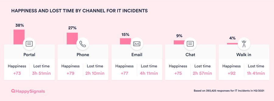
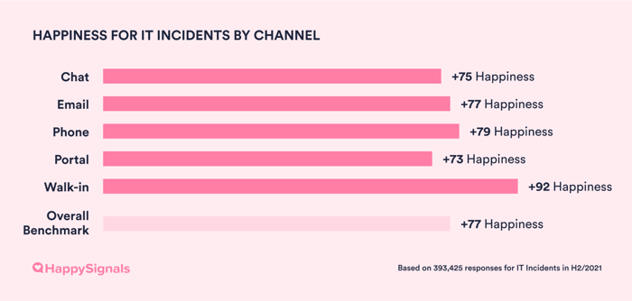
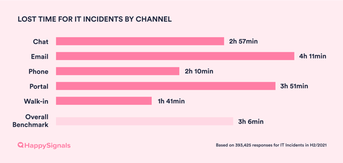
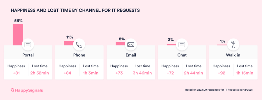
Based on the data from all our customers, there are only slight differences in overall happiness with the digital channels – Chat, Email, Phone, and Portal (all range from +73 to +79). The only channel with significantly higher happiness is Walk-in (+92). The perception of lost time is also by far the lowest for Walk-in IT support, with just 1h 41min on average per incident, 30 minutes less than the second least time-consuming channel, Phone.
|
|
|
|
We hypothesize that end-users who use the Walk-in channel have much better experiences because talking to a service agent in-person likely results in the problem being resolved then and there. This reduces ticket reassignments and the likelihood of end-users needing to explain their case several times – both of which produce poorer experiences, as discussed in the previous section.
But while Walk-in delivers great service experiences, it is also the most expensive channel for IT to maintain. Many companies have stopped providing Walk-in because of how resource-intensive it is, and understandably so! For large multinational organizations without dedicated IT teams in every operating country, Walk-in will also be inaccessible to many employees. Hence, promoting Walk-in over digital channels isn’t a sustainable approach either.
What this means for you?While the overall channel happiness data doesn’t reflect major differences between digital channels, we know from working with our customers that within each organization, there can be huge differences!
|
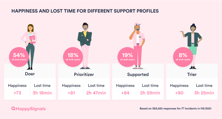
While in previous sections we have discussed the experiences of IT end-users as a whole with various aspects of the IT service process, there are also behavioral and motivational differences between end-users. Understanding these differences is key to tailoring your IT services for different types of end-users.
This is where HappySignals IT Support Profiles come in handy.
Based on interviews with over 500 end-users, we found two main behavioral drivers to have the greatest impact on end-user behavior and experience: Competence (how capable the end-user is of fixing IT problems independently), and Attitude (how willing the end-user is to solve the problem independently).
Mapping differences in these two drivers, we defined four Support Profiles: Doer, Prioritizer, Trier, and Supported. Learn more in our Guide on using Profiles in IT Service Desk.
Consistent with previous years, Doers again have the lowest Happiness of +73, while Supported are still the happiest with Happiness of +84.
|
|
Why have these patterns remained so stable? We have several hypotheses.
Since Doers are both capable and willing to solve most IT problems by themselves, they likely only raise tickets when faced with complex problems. Such problems are naturally also harder for service agents to solve quickly, resulting in a poorer experience for the Doer. As technically capable end-users, they may also be more demanding of service quality and speed.
As for the Supported, they are neither competent nor eager to solve IT problems on their own and just want someone to help them out. They may be less demanding of IT services, resulting in higher Happiness ratings on average. They may also raise tickets even for simple issues which are easy for agents to solve, producing smoother service experiences.
It is fascinating to notice how different support profiles gravitate towards different channels, in a way that confirms the behavioral drivers identified in our original research about IT Support Profiles! The data on IT incident channel usage by different profiles highlights the following patterns:
Doers, who like fixing issues themselves, are by far the most avid users of self-service Portals and the least likely to use Phone.
Prioritizers on the other hand, use Phone more frequently than other support profiles, which fits their profile of wanting problems solved with minimal participation – a 'someone should do it for me' attitude.
Supported and Triers use Walk-in IT support 30-35% more frequently than Doers and Prioritizers, which is in line with their preference for personal help that enables them to learn, from service personnel that are patient with them.
|
|
What this means for you?You cannot change your end-users, but you can tailor your IT services to different support profiles. For example, by personalizing how service agents talk to different profiles the next time they reach out to the service desk. Doers and Prioritisers are more comfortable with technical language, while Supported and Triers may appreciate plain language and clear step-by-step walkthroughs.
|
|
|
|
|
| Channel usage for IT Requests | H1/2019 | H2/2019 | H1/2020 | H2/2020 | H1/2021 | H2/2021 |
| Chat | 1% | 1% | 2% | 2% | 3% | 3% |
| 8% | 8% | 8% | 7% | 10% | 8% | |
| Phone | 18% | 22% | 19% | 17% | 13% | 11% |
| Portal | 66% | 60% | 50% | 57% | 57% | 56% |
| Walk in | 1% | 1% | 2% | 2% | 2% | 1% |
| Unknown | 6% | 8% | 19% | 15% | 15% | 21% |
Discover detailed historical data in the PDF Report.
The saying “Technology changes, People stay the same” rings true in our data. The Factors that create positive, neutral and negative experiences with IT Requests for end-users remain very stable.
| IT Requests - Positive Factors | H1/2019 | H2/2019 | H1/2020 | H2/2020 | H1/2021 | H2/2021 |
| I was informed about the progress | 32% | 31% | 32% | 36% | 36% | 35% |
| Instructions were easy to understand | 28% | 29% | 31% | 31% | 31% | 32% |
| It was easy to describe what I wanted | 31% | 31% | 31% | 32% | 33% | 34% |
| Service personnel's attitude | 49% | 48% | 48% | 48% | 48% | 46% |
| Service personnel's skills | 46% | 46% | 46% | 46% | 45% | 44% |
| Speed of service | 79% | 79% | 78% | 79% | 80% | 80% |
| IT Requests - Neutral Factors | H1/2019 | H2/2019 | H1/2020 | H2/2020 | H1/2021 | H2/2021 |
| I had to explain my case several times | 16% | 15% | 15% | 16% | 15% | 14% |
| I wasn’t informed about the progress | 11% | 11% | 12% | 11% | 11% | 11% |
| Instructions were hard to understand | 7% | 8% | 7% | 9% | 8% | 7% |
| It was difficult to describe what I needed | 8% | 8% | 8% | 8% | 8% | 8% |
| It was difficult to know where to start | 13% | 11% | 11% | 11% | 12% | 11% |
| Service personnel's attitude | 5% | 5% | 4% | 4% | 6% | 5% |
| Service personnel's skills | 7% | 7% | 6% | 6% | 6% | 5% |
| Speed of service | 57% | 59% | 58% | 56% | 58% | 58% |
| IT Requests - Negative Factors | H1/2019 | H2/2019 | H1/2020 | H2/2020 | H1/2021 | H2/2021 |
| I had to explain my case several times | 34% | 32% | 32% | 30% | 31% | 30% |
| I wasn’t informed about the progress | 24% | 22% | 28% | 29% | 26% | 28% |
| Instructions were hard to understand | 13% | 12% | 11% | 12% | 11% | 11% |
| It was difficult to describe what I needed | 7% | 8% | 6% | 6% | 7% | 7% |
| It was difficult to know where to start | 11% | 10% | 10% | 11% | 10% | 10% |
| Service personnel's attitude | 8% | 8% | 8% | 9% | 8% | 8% |
| Service personnel's skills | 17% | 17% | 16% | 16% | 12% | 13% |
| Service was slow | 55% | 55% | 58% | 56% | 56% | 57% |
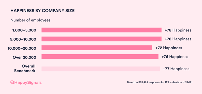
In H2/2021, the effect of company size on end-user happiness has become practically insignificant.
In the last H1/2021 report, the difference in end-user happiness between differently sized companies was over 10 points. Now, the difference is down to 6 points, with no longer any pattern of lower happiness for larger companies.
|
|
| Happiness by company size | H1/2021 | H2/2021 Overall |
| 1,000–5,000 employees | +81 | +78 |
| 5,000–10,000 employees | +79 | +78 |
| 10,000–20,000 employees | +72 | +72 |
| More than 20,000 employees | +69 | +73 |
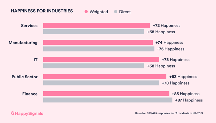
This is the second report in which we are releasing any information about the differences between industries. We still do this with caution, as we know that there are many factors apart from industry that can influence end-user happiness with IT.
We derived the Happiness scores for comparing between industries by creating a weighted average that eliminates non-industry-specific differences in end-users’ happiness ratings.
In these weighted scores we have removed the effect of two things: Employee Support Profile and Country. For example, IT as an industry has the most demanding (technically skilled) employees. Hence, its industry happiness becomes much higher in the weighted score, as you can see from the graph.
|
|
In Finance and the Public Sector, it is slightly easier to make end-users happy with IT. These industries have stricter regulations, making them more stable in their ways of working. That could be a factor that impacts how IT can match end-user expectations in their interactions.
The fact that end-users in IT companies are the most demanding does not come as a huge surprise. Employees in IT companies are more likely to be technically-skilled Doers who can solve simpler IT issues by themselves. Hence, they go to IT support with more complex problems, and have more demanding expectations of the resolution process.
What this means for you?When comparing your results with the industry-specific Happiness scores, remember that it’s also relevant to consider where your employees are from. It might well be that the HappySignals benchmark for your industry is difficult for you to reach if most of your employees are from countries with more critical end-users, like Germany and the Netherlands. More on these country-specific differences a few sections down!
|
HappySignals tracks how different organisations who use our platform are able to improve end-user experiences through experience management. We do this by comparing end-user happiness in our customers’ first two months of using HappySignals (baseline before they have made any improvements), with the happiness now.
Companies using outsourced service desks have on average increased end-user happiness by 33%, while companies using internal service desks only increased it by 11%.
|
|
Keep in mind however, that this report is only based on data from HappySignals customers. In our customer base the bigger the organization, the more likely it is that the organization has outsourced their service desk:
Like in previous reports, we continue to observe country-specific differences in end-user happiness. For example, end-users in Ukraine are the easiest to please, while end-users in Sweden are the most critical.
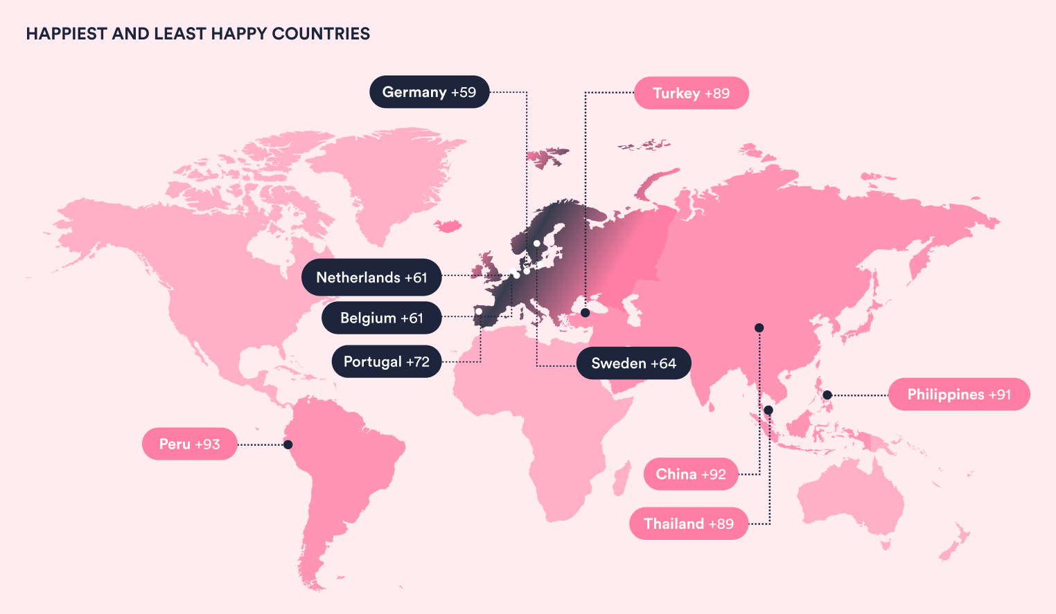
This country-specific data tells an interesting story: Comparing total Lost Time for the five happiest and five least happy (i.e. most demanding) countries, the demanding countries have lost about 20 minutes less than the happiest ones.
To us, this underlines the fact that end-users in some cultural contexts are more demanding and expect faster service than in others.
| Happiest Countries | Happiness | Lost time |
| Peru | +93 | 3h 5min |
| China | +92 | 3h 42min |
| Philippines | +91 | 3h 52min |
| Turkey | +89 | 3h 5min |
| Thailand | +89 | 3h 7min |
| Least Happy Countries | Happiness | Lost time |
| Germany | +59 | 3h 17min |
| Netherlands | +61 | 3h 38min |
| Belgium | +61 | 2h 26min |
| Portugal | +64 | 4h 7min |
| Sweden | +64 | 3h 0min |
What this means for you?There are notable differences in end-user rating behavior between different countries. Understanding these cultural-specific rating differences will help you to understand your end-users’ happiness levels and experience data in context.
|
Support Profile distribution in different Countries
Another interesting finding that we will need to look into more before publishing detailed results is a noticeable difference between the distribution of support profiles in different countries:
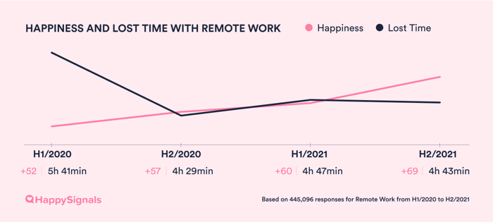
Enterprises continue to get better at supporting employees in remote work. Happiness with Remote Work increased from +57 to +69 over the past year.
|
|
However, we cannot make direct comparisons between the factors influencing happiness with Remote Work in H1/2021 and H2/2021 in this report. This is because HappySignals changed the factors included in our Remote Work survey in H1/2021.
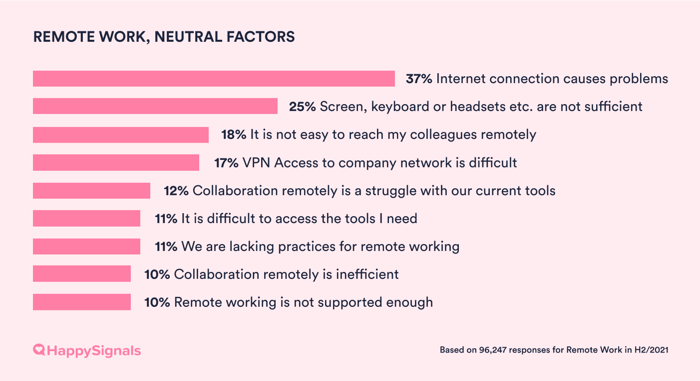
Looking only at the H2/2021 data however, end-users made more evenly distributed selections between the given Remote Work factors, as compared to for Ticket-based IT. In other words, no specific factors stand out as dominant influencers of end-user happiness or unhappiness with remote work.
|
|
|
|
|
|
What this means for you?There is no one-size-fits-all approach to how Enterprise IT can optimize remote work for your organization. The only way to find out is by collecting data directly from your own end-users.
|


Ready to get started?