
Understand what's really happening with your IT
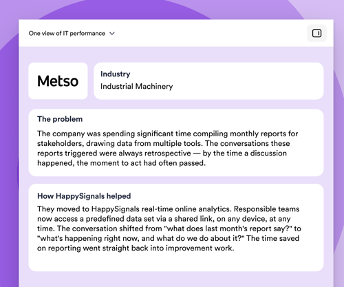
See how IT is really performing — one view, not six dashboards
What it means
Bring SLA, MTTR, ticket volumes, and continuous employee experience data into one view of service state — instead of stitching weekly reports together by hand.
Stop spending Monday mornings building "the real story" from six tools. Walk into every service review, vendor QBR, and exec update with the same numbers everyone has already seen. Trust in IT reporting goes up the moment the reporting stops contradicting itself.

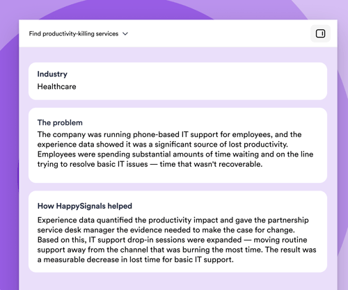
Find services that quietly eat productivity
What it means
Identify which IT services generate the most lost time per ticket — even when their SLAs look fine.
You stop spreading improvement budget thin across all services and concentrate it where employees actually bleed hours. This is your prioritization weapon for the next quarterly roadmap.
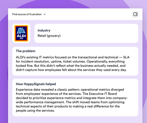
Catch services where frustration is growing (watermelon services)
What it means
Surface services where SLA, uptime, and ticket-resolution KPIs are all green, but employee experience and lost time are deeply negative — the so-called "watermelon effect."
This is the CIO's nightmare metric — and exactly the conversation IT needs to have with the business. It moves IT from defending dashboards to acknowledging reality, which actually builds trust faster than green KPIs ever did.

See how IT is really performing — one view, not six dashboards
What it means
Bring SLA, MTTR, ticket volumes, and continuous employee experience data into one view of service state — instead of stitching weekly reports together by hand.
Stop spending Monday mornings building "the real story" from six tools. Walk into every service review, vendor QBR, and exec update with the same numbers everyone has already seen. Trust in IT reporting goes up the moment the reporting stops contradicting itself.
Find services that quietly eat productivity
What it means
Identify which IT services generate the most lost time per ticket — even when their SLAs look fine.
You stop spreading improvement budget thin across all services and concentrate it where employees actually bleed hours. This is your prioritization weapon for the next quarterly roadmap.
Catch services where frustration is growing (watermelon services)
What it means
Surface services where SLA, uptime, and ticket-resolution KPIs are all green, but employee experience and lost time are deeply negative — the so-called "watermelon effect."
This is the CIO's nightmare metric — and exactly the conversation IT needs to have with the business. It moves IT from defending dashboards to acknowledging reality, which actually builds trust faster than green KPIs ever did.
Make better decisions
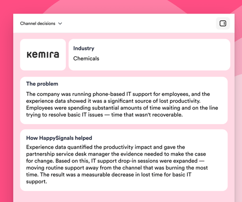
Decide which channel to invest in (and which to retire)
What it means Compare happiness scores and lost time per channel — phone, portal, chat, virtual agent, walk-up — for the same ticket types.
So what? You stop the political "chat is the future" / "phone is dead" debates. Data shows that for password resets, chat wins; for hardware issues, phone wins. Invest accordingly instead of forcing one channel for everything.

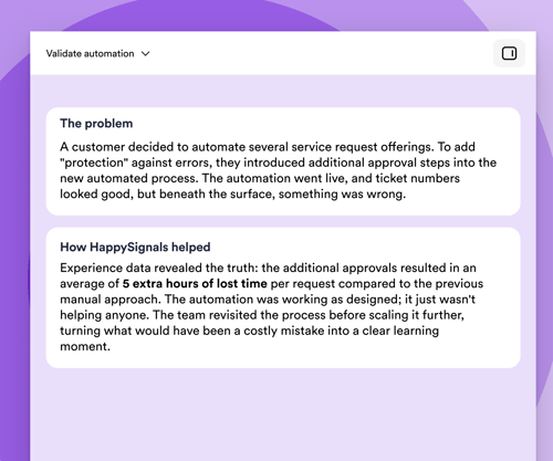
Validate (or kill) an automation before scaling it
What it means
Measure happiness and lost time before vs. after introducing automation, AI agents, or self-service for a specific ticket type — at the user level, not the operational level.
Most automation business cases are built on ticket resolution numbers. But resolved doesn't mean happy. This use case answers: "Did our automation investment actually help employees, or did it just hide tickets in a worse experience?"
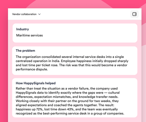
Turn vendor reviews into shared improvement conversations
What it means
Bring independent experience data — happiness and lost time per ticket — into the same room as your vendor's own performance reports. Use it to identify where employees are losing the most productivity, agree on the biggest improvement opportunities together, and track progress against a shared baseline over time.
SLA reporting tells you whether tickets are closed on time. It doesn't tell you whether the employees on the other end got their hours back. When you can see lost time and experience per service, per tower, and per vendor — measured consistently — vendor conversations stop being a debate about whose numbers are right and start being a joint plan for where to focus next. The value isn't in calling vendors out; it's in giving everyone the same productivity picture to work from.
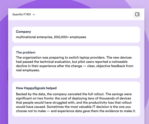
Quantify the ROI of IT investments in business-relevant numbers
What it means
Translate IT improvements into recovered employee hours × loaded cost = dollars returned to the business. Use this as the standard ROI language for IT initiatives.
IT struggles to justify spending because uptime doesn't translate to dollars. "We saved 18,000 employee hours this quarter, worth ~$1.4M in recovered productivity." This becomes the CIO's standard board slide.

Decide which channel to invest in (and which to retire)
What it means Compare happiness scores and lost time per channel — phone, portal, chat, virtual agent, walk-up — for the same ticket types.
So what? You stop the political "chat is the future" / "phone is dead" debates. Data shows that for password resets, chat wins; for hardware issues, phone wins. Invest accordingly instead of forcing one channel for everything.
Validate (or kill) an automation before scaling it
What it means
Measure happiness and lost time before vs. after introducing automation, AI agents, or self-service for a specific ticket type — at the user level, not the operational level.
Most automation business cases are built on ticket resolution numbers. But resolved doesn't mean happy. This use case answers: "Did our automation investment actually help employees, or did it just hide tickets in a worse experience?"
Turn vendor reviews into shared improvement conversations
What it means
Bring independent experience data — happiness and lost time per ticket — into the same room as your vendor's own performance reports. Use it to identify where employees are losing the most productivity, agree on the biggest improvement opportunities together, and track progress against a shared baseline over time.
SLA reporting tells you whether tickets are closed on time. It doesn't tell you whether the employees on the other end got their hours back. When you can see lost time and experience per service, per tower, and per vendor — measured consistently — vendor conversations stop being a debate about whose numbers are right and start being a joint plan for where to focus next. The value isn't in calling vendors out; it's in giving everyone the same productivity picture to work from.
Quantify the ROI of IT investments in business-relevant numbers
What it means
Translate IT improvements into recovered employee hours × loaded cost = dollars returned to the business. Use this as the standard ROI language for IT initiatives.
IT struggles to justify spending because uptime doesn't translate to dollars. "We saved 18,000 employee hours this quarter, worth ~$1.4M in recovered productivity." This becomes the CIO's standard board slide.
Improve continuously
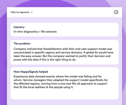
Tailor support to employee segments instead of one-size-fits-all
What it means
Segment experience data by role, location, device, seniority, or persona (e.g., "field engineers," "execs," "shop floor," "new hires"). Identify which segments are systematically underserved.
"Our overall CSAT is 4.2/5" is useless. "New hires in APAC report -30 happiness in their first 30 days, mostly around access provisioning" is a project plan. You design support journeys for the people who need them most, not for the abstract average.

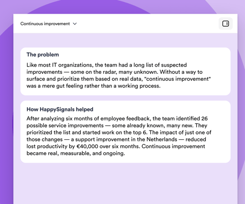
Build a continual improvement engine instead of one-off projects
What it means
Establish a closed loop in which experience data feeds into the Continual Service Improvement (CSI in ITIL) register/improvement backlog each week, with prioritization based on lost-time impact × frequency.
Most "continual improvement" programs die in a SharePoint folder. With a continuous flow of experience data, every CAB and service review has fresh evidence of what to fix next, and last cycle's improvements are measured against the same baseline. Improvement becomes a rhythm, not a project.
Prove every improvement actually worked
What it means: For every service improvement, process change, or new tool rollout, measure the experience and lost time at the level as granular as you wish.
So what? Most IT teams make dozens of "improvements" per quarter and have no idea which ones were helpful, which weren’t, or which made things worse for some users. Without this loop, continuous improvement is impossible. With it, you stop investing in changes that don't pay off and scale the ones that do.
Tailor support to employee segments instead of one-size-fits-all
What it means
Segment experience data by role, location, device, seniority, or persona (e.g., "field engineers," "execs," "shop floor," "new hires"). Identify which segments are systematically underserved.
"Our overall CSAT is 4.2/5" is useless. "New hires in APAC report -30 happiness in their first 30 days, mostly around access provisioning" is a project plan. You design support journeys for the people who need them most, not for the abstract average.
Build a continual improvement engine instead of one-off projects
What it means
Establish a closed loop in which experience data feeds into the Continual Service Improvement (CSI in ITIL) register/improvement backlog each week, with prioritization based on lost-time impact × frequency.
Most "continual improvement" programs die in a SharePoint folder. With a continuous flow of experience data, every CAB and service review has fresh evidence of what to fix next, and last cycle's improvements are measured against the same baseline. Improvement becomes a rhythm, not a project.
Prove every improvement actually worked
What it means: For every service improvement, process change, or new tool rollout, measure the experience and lost time at the level as granular as you wish.
So what? Most IT teams make dozens of "improvements" per quarter and have no idea which ones were helpful, which weren’t, or which made things worse for some users. Without this loop, continuous improvement is impossible. With it, you stop investing in changes that don't pay off and scale the ones that do.
Join the IT leaders who've made
experience count
.png)
Ready to see Experience Intelligence in action?

In case you're wondering
HappySignals helps ITSM teams understand how employees truly experience IT services — and where to focus improvements that boost productivity and satisfaction.
Here’s what it delivers:
-
Real-time experience insights: Measures Happiness and Lost Time for incidents, requests, and portal interactions — showing how IT impacts daily work.
-
High-quality feedback you can trust: Research-backed surveys drive 20–40% response rates, giving ITSM reliable data instead of guesswork.
-
AI-powered analysis: Automatically summarizes thousands of free-text comments so teams don’t need to read them manually. You instantly see the top themes, pain points, and improvement ideas.
-
Root-cause visibility: Combines experience data with ITSM operational data (services, assignment groups, channels, locations) to pinpoint issues fast.
-
Clear improvement priorities: Benchmarks and AI insights highlight where IT can reduce lost time and improve service quality.
-
Stronger business alignment: Helps IT move from SLA-driven reporting to experience-led decisions that show measurable business value.
In short: HappySignals turns ITSM data and employee sentiment into actionable insights — helping IT improve services, reduce productivity loss, and make employees happier.
Standard CSAT tells you if a user was satisfied. HappySignals shows you how IT services impact employees and productivity.
Here’s how we differ:
-
Higher response rates: CSAT typically gets 5–10%, while HappySignals delivers 20–40% thanks to simple, research-backed surveys.
-
Measures impact, not just satisfaction: We track Happiness and Lost Time, helping IT see where productivity is being lost.
-
Shows the “why,” not just the score: Built-in experience indicators explain what actually drove the rating.
-
Connected to operational data: You can instantly drill down by service, assignment group, channel, country, or vendor.
-
Benchmarked and actionable: Global benchmarks and AI summaries highlight where to focus your improvements.
In short: CSAT is a score. HappySignals is experience management — helping IT prioritize the changes that matter for employees.
HappySignals reveals the real reasons employees get frustrated with IT services—the things traditional metrics and CSAT scores typically miss.
Here’s what it uncovers:
-
Hidden productivity killers: Which incidents or services cause the most lost time, even if SLAs look green.
-
Root causes of poor experiences: Clear insights into factors like unclear instructions, slow communication, repeated reassignments, or long wait times.
-
Channel friction: Whether certain channels (portal, chat, email, phone) make work harder instead of easier.
-
Technical vs. human gaps: When issues feel “resolved” in the system but don’t feel resolved to the employee — the “Watermelon Effect.”
-
Employee profile differences: How frustrations vary by role, location, tech confidence, or work style.
-
Theme-level insights: AI summarizes thousands of free-text comments so IT can instantly see the top pain points without reading everything manually.
In short: HappySignals identifies the everyday friction employees face — and shows IT exactly where to focus to remove it.
HappySignals helps IT move from a cost center to a value-driving partner by showing how IT services impact productivity, employee satisfaction, and business performance.
Here’s how it enables the business:
-
Quantifies productivity gains: Measures Lost Time so IT can show how improvements return hours — or FTEs — back to the business.
-
Proves the value of IT investments: Links changes (new tools, processes, vendors) directly to employee experience and business outcomes.
-
Prioritizes what matters most: Highlights which issues affect productivity and happiness, helping IT focus resources where they deliver the biggest impact.
-
Supports experience-based governance (XLAs): Shifts conversations from SLA compliance to delivering real business value through better experiences.
-
Accelerates decision-making: AI summarizes feedback and themes so leaders can quickly understand what’s working — and what needs action.
-
Improves adoption of digital initiatives: Shows how employees perceive new tools and services, helping IT drive smoother rollouts and higher adoption rates.
In short: HappySignals turns ITSM data into business insights, helping IT make decisions that improve productivity, demonstrate value, and enable the whole organization to perform better.
HappySignals integrates seamlessly with modern ITSM tools to capture experience data automatically.
Today, the platform integrates with:
-
ServiceNow (certified Store app; easiest and most common)
-
Freshservice
-
Ivanti Neurons
-
BMC Helix
-
Jira Service Management (Cloud)
These integrations allow HappySignals to pull operational data (services, categories, assignment groups, channels, locations) so IT teams get full context behind the experience.
In short: If your ITSM tool manages tickets, HappySignals can plug into it — quickly and with minimal effort from IT.
