
IT service delivery: How many dashboards do you really need across vendors?
If you're a service delivery manager, you already know the answer, and it's more than one. On top of all of those, maybe you have an Excel spreadsheet somebody built two years ago because none of the vendor tools could show what leadership actually wanted to see. By the time you've opened all of them, you've usually found three different versions of what's going on. The infrastructure vendor says uptime is at 99.8%, the service desk platform says resolution time is trending green, and the CIO's inbox already has two complaints from department heads this week.

Nobody's dashboard is technically wrong. They're each telling a different, partial story, and trying to figure out the main plot from those stories has quietly become most of the job.
The problem: fragmented data across towers and vendors
Multi-vendor IT environments don't set out to create fragmented visibility.
It happens one contract and one tool at a time. Each tower brings its own tooling, and each vendor reports against its own SLAs, in its own format, on its own cadence.
The person responsible for the health of the whole service ends up doing the integration work by hand: copying numbers into a slide, translating vendor-speak for a business stakeholder, guessing at what's connected to what when three towers all show green, but users are still complaining.
That's time that should go toward spotting risk early, spent instead on reconciling reporting formats.
And it's not just a time cost. It's a decision-quality cost. When leadership asks how healthy the service really is, the honest answer often needs a meeting and a few days' notice. Not because the data doesn't exist, but because it doesn't exist in one place.
There's a second layer to this, and it's the one that causes the real damage: most of these dashboards are built around metrics vendors control and report favorably, such as uptime, ticket volume, or MTTR.
They describe whether the infrastructure is technically working, but they don't describe whether the people relying on it are having a good experience.
A tower can hit every number in its contract and still be the quiet source of frustration across the business. When that happens, you're trying to explain a gap between "the numbers say we're fine" and "the business says we're not," with tools that were never built to capture the business's side of that story.
What one view actually requires
Consolidation here doesn't mean building one more dashboard. Real consolidation needs a measurement layer that sits above individual towers and vendors, so performance can be compared on equal terms regardless of who's delivering the service.
It needs the end-user's actual experience to be shown alongside the operational metrics, so green means the same thing everywhere in the environment.
And it needs to hold up as vendors change, because the vendor roster this year won't be the vendor roster in three years, and nobody wants to rebuild their visibility stack every time a contract turns over.
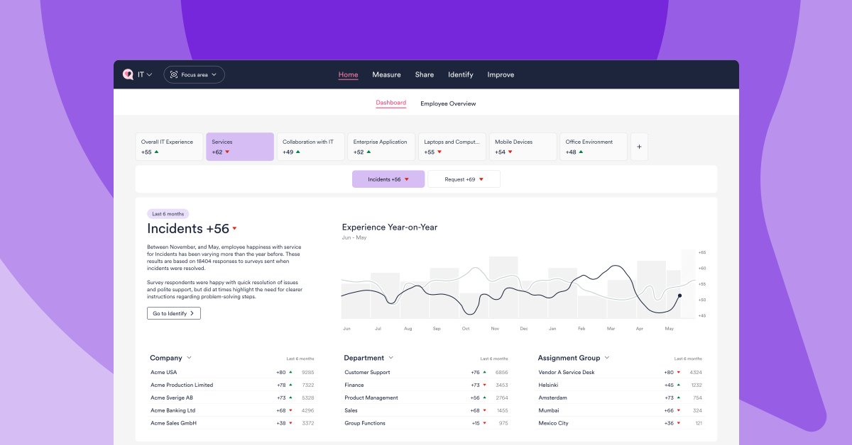
This is what HappySignals does differently from a survey tool or a single-vendor reporting suite: it's an IT experience intelligence platform built to sit above the tower-by-tower view, combining validated experience data with your operational data into one consistent picture.
That picture is segmented by team, tower, vendor, or user group, however you need to cut it. Instead of five reports stitched together under deadline pressure, you get one line of sight into how the whole service is actually landing with the people who depend on it.
It also resets the vendor conversation. When every tower is measured against the same experience-based view, a vendor can't point to their own dashboard as proof that everything's fine while the rest of the business tells a different story.
The conversation moves from SLAs to what's actually happening for the people using this service. It's a much harder point to argue with, and a far more useful thing to manage against.
There's a segmentation problem hiding underneath the sprawl, too. Even when a vendor's own dashboard is accurate on its own terms, it usually can't slice the data the way you actually need to manage it. You end up asking each vendor to pull a custom cut, on their timeline, in their format, and then reassembling those cuts yourself before anyone can act on them. A single view only solves the sprawl problem if it can also be broken down on your terms, not just theirs.
This is also where the XLA conversation becomes practical rather than theoretical. Moving from SLA to XLA doesn't mean throwing out the vendor contracts. It means adding a layer above them that measures experience consistently, so an XLA can actually be compared across towers, the same contract-based SLA never could be.
Two vendors with identical uptime SLAs can produce very different employee experiences; without a shared experience layer, that difference stays invisible until it shows up as a complaint.
If your instinct is "we already get quarterly business reviews from each vendor", that's exactly the problem. Quarterly, vendor-reported, and siloed by tower is the opposite of a live, independent, cross-vendor view.
By the time a QBR surfaces an issue, it's usually been building for months.
Proof: what this looks like in practice
This isn't theoretical.
Nina Remes, who manages IT Processes & Tools at Hiab, put it plainly: "We rely on HappySignals data for our measurements, processes, and managing vendors."
That's the shift in one sentence, from vendor-reported numbers to a shared, independent measure everyone works from, including the vendors themselves.
What changes when the view is unified
Once service health lives in one place, the job changes shape. Instead of spending the first two hours of the day assembling a picture, you spend that time acting on it: flagging a tower trending down before it becomes an escalation, showing leadership one credible number instead of four competing ones, and having an actual conversation with a vendor about experience instead of an argument about whose dashboard is right.
None of this is really about dashboards. It's about what it takes to manage a service that no single team or vendor fully owns.
The more towers and vendors involved, the more essential a single, trustworthy view becomes, not stitched together from five sources under deadline pressure, but built in from the start.
See what a single view looks like in your environment. Start with Discover and see the value in days, not months!

One insight a month, in your inbox.
New articles, benchmark data, and customer stories. No fluff.